Midnight Hare: page 21
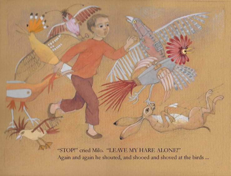
Work in progress, a half finished picture – this was always going to be a difficult page, and going back to it, I see that I shall have to rework it, as the hare is too big, and Milo’s head is too big, and his expression is not right. But the birds, which I was worried about, are as I want them. I have ordered some paper that is wide enough to cross over two pages, and am now going to get back to work and finish enough of this book to send it out. I have been going through a stage when I feel somewhat dissatisfied, but this always happens at some point in a project; I still like the story and I like the techniques I am using, but still I see these faults after I have been working some time on a painting. However, doing a painting again, when the basic design is there, does not take much time. What else do I like? I like the colours, and I like the hoopoe… well, I like the birds on the whole. They are both scary and fun, which is what I always wanted.
7 Comments »
Leave a comment
-
Archives
- January 2024 (1)
- December 2023 (1)
- November 2023 (2)
- October 2023 (4)
- September 2023 (1)
- August 2023 (7)
- July 2023 (5)
- March 2023 (1)
- February 2023 (3)
- January 2023 (10)
- April 2022 (1)
- March 2022 (3)
-
Categories
-
RSS
Entries RSS
Comments RSS

I actually do like the hare as it is😉
LikeLike
Thank you, Caroline. Someone else also liked the picture as it is, so I may leave the hare alone, and work on Milo’s expression. It is easier to rework details in gouache rather than watercolour – I am using a variety of media in these illustrations but gouache is probably the main one, as its opaque colours show up well against the darker background. I couldn’t use white paper with a white hare as the protagonist – I did try, and it didn’t work, not to my liking, anyhow! Comments are really useful, so thank you again.
LikeLiked by 1 person
Good luck for the rest of the story 😉 hope to see more great illustrations 😉 have you tried blue mi-teintes paper? It’s gives you light to the whole illustration, something that’s a little bit difficult with gouache.
LikeLike
Tha’t’s interesting, about the blue mi-teintes paper. All the illustrations I am doing for the book are on shades of brown and I will keep that for consistency, but I will try experimenting on blue mi-teintes when the book is finished. Do you mean that the blue works with gouache to give light to the illustration? Or with watercolour, or a mixture? I have only just started working on coloured paper again, after a long absence. I was working with crayon more than gouache this afternoon, both ordinary Faber crayons and neo-color – I have decided to do the sky in one of the pictures that goes right across two pages in crayon, as I think with gouache it woudl become much too heavy. Thank you for the advice about the mi-teintes blue.
LikeLike
I would use the mi-teintes with gouache or acrylic paint. It is too thin for watercolour. Here (https://carolinecastrocarvalho.wordpress.com/2014/10/13/childrens-book-contest-concurso-de-ilustracao-infantil/) is how I did some illustrations with mi-teintes paper. For a night-scenario I used blue paper and for day-scenario I used salmon(ish) paper. Use the different colors for different purposes.. If you would paint a jungle you could use a green mi-teintes paper for example. I’m no expert 😉 that was something I learned in my illustration course and it’s really useful.
LikeLike
Lovely illustrations of yours, Caroline. I see what you mean about the paper helping create an effect of light. I am only just beginning to explore painting on darker paper – well, I used to do this, but for years now I have only illustrated using pen and ink and watercolour on white paper. At the moment I am experimenting with crayon, neocolor wax crayons and gouache on coloured Ingres. I feel at last I am getting somewhere near the effect I want – layers of colour, without one layer cancelling the other out/muddying the colour; and I am also trying to keep the drawn element as part of the design, but with a much looser feel than with pen and ink. I look forward to trying out the different colours you suggest, it is indeed a useful suggestion.
LikeLiked by 1 person
Keep up the good work! Your illustrations are lovely! Look forward to seeing more of your experiments😉
LikeLike